(Note: this post was updated on March 18. A age-specific comparison of flu mortality with all cause mortality was added in the addendum below.)
The exact age-pattern of the Covid-19 pandemic is still emerging, with older people clearly at more risk than younger. Meanwhile, the pattern of deaths attributed to influenza in past years can give us a point of comparison. This time may be different. But different from what?
In this post, I use the Human Cause-of-Death Database (HCD) to describe the age patterns of recent influenza mortality in European countries, Japan, and the United States.
Cause-specific mortality rates indicate the chance of dying from a cause over the course of a year. This is an unconditional rate, meaning it doesn’t require exposure to the disease or other cause. The rates are very low in absolute terms because most people do not die of anything from one year to the next. The mortality rate among those who contract an illness, known as the “case fatality rate,” is much higher.
The patterns are fairly clear:
- For adults, risks rise exponentially with age, especially after age 80.
- The flu has a similar age pattern across most years in most countries.
In future posts, I will try to report on the differential risks to men and women. A great thank you to the creators of this database at the French Institute for Demographic Studies (INED) in Paris, France and the Max Planck Institute for Demographic Research (MPIDR) in Rostock, Germany.
Flu mortality by age
To start with, let’s look at the deaths classified as “Influenza” in the United States in 2013. This is hte most recent recent year available and a year of high influenza mortality.
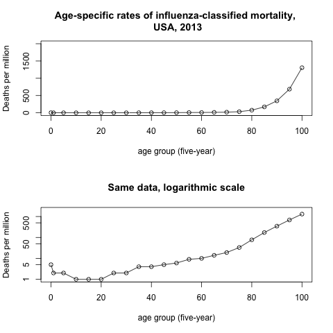
The upper panel shows annual deaths per 1 million persons. At ages 80-84, the mortality rate was 77 per million and at ages 85-89 it was 172 per million.
We can see that influenza mortality in 2013 was very low below age 80. For the oldest old influenza-classified mortality was higher but still only on the order of 1000 per million or 0.1 per cent.
The lower panel plots the same mortality rates using a logarithmic scale. Here a straight line shows an exponential rate of increase with age. We see a gradual increase from ages 40 to 80, with more rapid increases over age 80.
Age-profiles in different years
The US data is available from 1999 to 2013. The HCD allows us to see if the profile of mortality by age looks similar across different flu years.
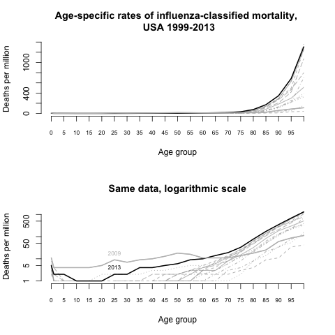
The 2013 influenza-classified mortality appears to have been the most severe since 1999. The less severe years had a similar profile, with the possible exception of 2009, which, compared to other years, had lower mortality for the old, but higher mortality for the young.
Age-profiles of influenza mortality outside the United States
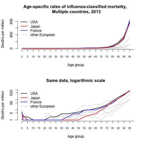
Finally, we can look to see if the age-profile is similar in other countries as the United States. In 2013, we see that across all of the countries in the HCD, influenza mortality is very low below age 80 and rises exponentially at older ages. The United States, Japan and France all show similar patterns, although – in 2013 at least – the United States suffered higher mortality and Japan the lowest.
Summary
The Human Cause-of-Death Database allows us to see that influenza-classified deaths have in recent years been largely restricted to the elderly, with mortality increasing exponentially but at a slow rate from young adult years to about age 70 and then more quickly at older ages.
In the United States, there was one year, 2009, when the age-profile was much flatter, with mortality being higher than other years for the young, and lower than other years for the elderly.
The HCD also allows us to look at sex differences in influenza-classified mortality as well as to look at causes of death such as pneumonia that are not directly classified as influenza but may be related. We’ll try to do this in later posts.
Addendum: Does higher flu mortality at older ages follow the usual pattern of senescent mortality?
Mortality, regardless of cause, also follows a pattern of exponential increase with age. Is the flu any different? (Thanks to Ron Lee for this question!)
We can use the HCD to compute the fraction dying of a flu-attributed cause compared to all other causes. We express this as an odds ratio of flu-mortality to non-flu mortality by age.
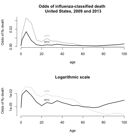
The figure above shows the odds of a death attributed to influenza for the United States in the two years we highlighted earlier 2009 and 2013. Both years showed interesting patterns.
In 2009 when there was slower increase in the flu mortality rate with age, we actually see a rapid decline in the relative danger of the flu compared to dying from other causes. The most dangerous age group is 10-14 years, when baseline mortality is very low. After age 30, the relative risk falls as baseline mortality rises more quickly than flu mortality.
In 2013, the odds of dying from flu decline up to age 70 and then rise again at older ages. The relative risk in the 70-74 age grup is .0008, risking to 0.0031 in the 100-104 age group.
The odds of dying of an influenza-attributed cause in both years were very small, relative to background age-specific mortality. But the age patterns may still be revealing. In 2009, relative odds tilted toward the young. But the more typical profile, seen in 2013, was that flu deaths followed the general contour of sensescent mortality.
Did flu indeed reflect senescent mortality—a wild if slightly clinical name for expected lifespan—or why wouldn’t it be more pronounced?