COVID-19 appears to be more dangerous for the elderly and for those already suffering from poor health. Because this is the same pattern as all-cause mortality, we can already predict which states in the country face the biggest threat from the virus.
In this post, I describe the pattern of existing mortality inequality in the United States. For the epidemic, I don’t expect these inequalities to reveal themselves right away. Today, we are seeing mortality in the places where people were first infected. Soon, we will see differences that depend largely on social distancing policies and their effect on the fraction of the population that is infected. But in the longer run, as roughly equal fractions of the people in each state become infected, the differences in background mortality are going to be an important force.
Per capita death rates and the age-structure of the population
The strongest predictor of all-cause mortality is age. For adults, the risk of dying doubles about every 7 years. An 80-year-old faces twice the risk of dying in the next year as a 73-year-old, and 4 times as much risk as a 66-year-old.
States differ in their age structure. More than 20 percent of Floridians are over age 65, but the share of Californians over age 65 is less than 15 percent. This is reflected in their per capita death rates. In Florida the crude death rate is 9.6/1000 but in California it is nearly a third lower, at 6.7/1000. This is the case, even though at each age, Floridians face about the same risks as Californians.
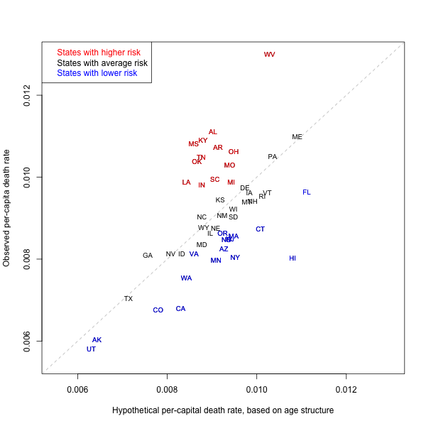
The x-axis shows the hypothetical per capita death rate predicted by age structure according to national age-specific death rates. The y-axis shows the actual observed per capita death rate. The vertical distance from the dashed line shows the amount by which death rates are higher (in red) or lower (in blue) than if they had the same mortality as the national average.
In the figure, I show on the x-axis the hypothetical per capita death rate of each state, if the only thing that mattered were age structure. I calculate this hypothetical by applying the age-specific mortality rates observed for the whole country to each state, and then calculating each states implied per capita death rate.
(For demographers, this hypothetical per capita rate is an indirectly standardized crude death rate, applying a standard schedule of national mortality rates to each state’s age structure.)
The hypothetical per capita rate tells us what we would expect for each state if the only thing that mattered were age structure. Looking only horizontally, left to right (without taking into account the vertical position), we see that Florida, Hawaii, Maine, West Virginia, Vermont, Rhode Island, and Connecticut would all have among the highest per capita death rates, simply because their populations tend to be older. On the other end, Utah, Alaska, Texas, Georgia, Colorado, Nevada, and California would all tend to have the lowest per capita death rate, because their populations tend to be younger.
It is important to understand how large these differences are. For example, looking along the x-axis, we see that age structure alone predicts that Maine would have nearly twice the per capita death rate as Utah. As the epidemic advances, and per capita death rates are reported for many states, it will be important not to mistakenly attribute these differences to actions taken by governments or differences in treatment. Instead, an important part of the differences is simply due to some states having a higher (or lower) fraction of people at older ages. Two states could be addressing the epidemic with equal success (or failure) and end up with quite different per capita death rates because of their age structure.
The per capita death rate is a statistical construction and should not be confused with differences in individual-level risk.
Real differences
The figure allows us to see beyond age structure. The dashed line shows the prediction for the per capita death rate based on age structure alone. We can interpret the position of each state above or below this expectation as being driven by real differences in the level of mortality, once we have taken age into account.
Most notably, the state with the highest per capita death rate is West Virginia. Even if age-specific mortality rates were no different from the rest of the country, West Virginia would still have among the highest per capita death rates because its population is older. However, the figure shows that West Virginia has enormous surplus mortality beyond age structure. It is positioned much higher than the prediction along the dashed line, raising its actual per capita mortality by a factor of more than 30 percent.
In general, we can see that a number of states in the South (Mississippi, Kentucky, Alabama, Tennessee, Arkansas, Louisiana, South Carolina) and some in the Midwest (Ohio, Michigan, Indiana) have significant surplus mortality. In contrast, California, Washington, Florida, Minnesota, New York, and Hawaii are among the states in which mortality is lower.
Implications for the epidemic
Will these differences in all-cause mortality predict the death toll of COVID-19? Broadly speaking, I believe the answer is yes.
First, the differences between predicted and observed death rates follow the same contours as differences in health status and cause-specific mortality. For example, the South has higher rates of diabetes and heart disease, while the West has lower rates of these health conditions. [For heart disease, see this map] Co-morbidity is already being seen to be a major predictor in COVID-19 death rates. We can expect COVID-19 mortality to follow the patterns we observe.
Second, public health measures are also likely to be correlated. Some of the states (e.g., California) that overperform in terms of per capita mortality are also those that invest more in public health. The same states are among those that have taken the strongest measures in terms of social distancing and preparation for the COVID-19 epidemic. Conversely, some of the states with the poorest records of public health investment are the last to have taken strong measures against the epidemic.
Third, racial differences are an important part of the explanation for why some states overperform and underperform on all-cause mortality. The Deep South, with its history of racial oppression, has enormous surplus mortality in normal times, and we can expect that this will again be revealed in this epidemic.
Take home messages
I believe there are three take home messages:
1. Don’t prematurely attribute per capita differences in COVID-19 mortality to differences in policy or other causes. A big reason for the difference will simply be age structure, which reflects itself in the per capita numbers but does not actually mean that individuals in some states face higher risk beyond their age.
2. If COVID-19 follows the same patterns as all-cause mortality, then — after taking age structure into account — we can already predict which states will face the greatest death toll. The poorer underlying health status of populations in the Deep South and parts of the Midwest means that these states face a larger threat from the epidemic.
3. New York is not the worst case in terms of the threat to its population. True, it was exposed early to infection. True also, it was late (compared to California and other states) in imposing social distancing measures. But in terms of health status, New Yorkers in normal times overperform the national average. This does not bode well for residents in states that have higher mortality in normal times.
Thanks for this piece! Fascinating question of the health of Nee Yorkers to the rest of the nation. But doesn’t the question of their exposure to a greater load of infection have greater bearing on their rates of survival or mortality? If the load was more pronounced—as it seems to have been in Lombardy in Italy, and was in China, in Wuhan or Hubei—mortality would grow, independently of comorbidity or health, as important as these factors are. A good example is the striking death of doctors and health workers in northern Italian hospitals, which has so tragically complicated the ability to contain the disease.
Yes, I think this is right. In the short term, differences in among states will echo differences in the prevalence of infection. If (or when?) infection rates equalize, then the differences in health status among states will emerge.