Novel diseases are likely to be most risky for specific ages and sexes. The challenges posed by Covid19 are playing out at this time on the global stage. Demography tells us where this, and other novel diseases, are likely to have a big impact – because any country’s demography tells us the ages and sexes of the people there.
Children would bear the brunt of anything resembling a childhood infectious disease. Adults are robust to many things, but something like the 1918 flu would hit adults hardest. And viruses like Covid19 appear to have the biggest affect on people over 70. Sex matters too. For Covid19, up to this time, males are twice as likely as females to get infected.
The graphs below show how the percentages of young and old vary across the globe today (in 2020) and a generation from now (in 2050), using UN Population Division data.
Worldwide distribution of the elderly
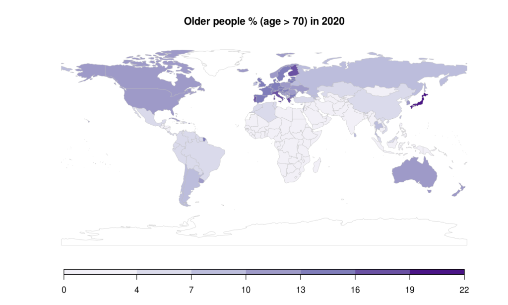
Looking at just the old, and so at the risk associated with a spread of Covid19 among people over 70:
- Italy stands out with a high % of older people. So clearly Italy is potentially – and in fact – a high risk area.
- Other high-risk areas in Europe are Finland, Portugal, and Greece.
- But … Japan is just as high-risk as Italy, yet their Covid19 epidemic so far seems to have much less impact than in Italy. Why? Is it just better warning and protection? A better prepared, or better, health system?
- Canada appears to be a high-risk area.
- The US marches with the rest of Europe, the UK, and Australia as the next lower cluster of risk.
- China, Russia and countries in the former Soviet Union, and the giants of South America, are next. So China, where the epidemic started, is only a moderate risk country by this measure, which seems to match what has been happening there in the past few weeks.
- Africa, most of Central Asia, and India are lowest risk.
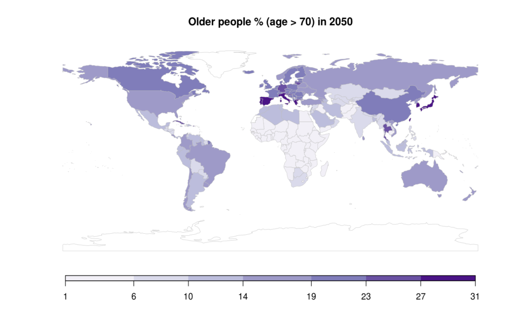
These rankings change modestly by 2050, a generation from now.
- Japan and South Korea lead in these rankings of risk.
- Spain joins Portugal, Italy, Greece
- China joins of the rest of Europe, Canada, and the UK, as this level of risk rises.
- The US and Australia are little changed in the ranks – but of course a key assumption behind the maps is that immigration continues at past rates. This has clearly become a questionable assumption.
Worldwide distribution of the young
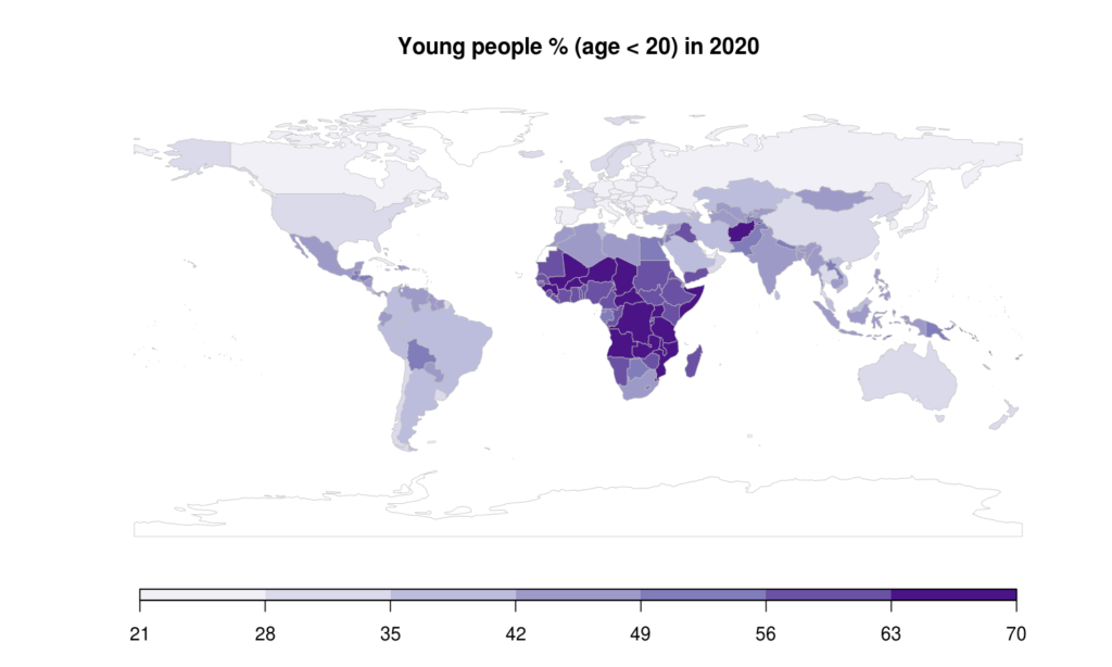
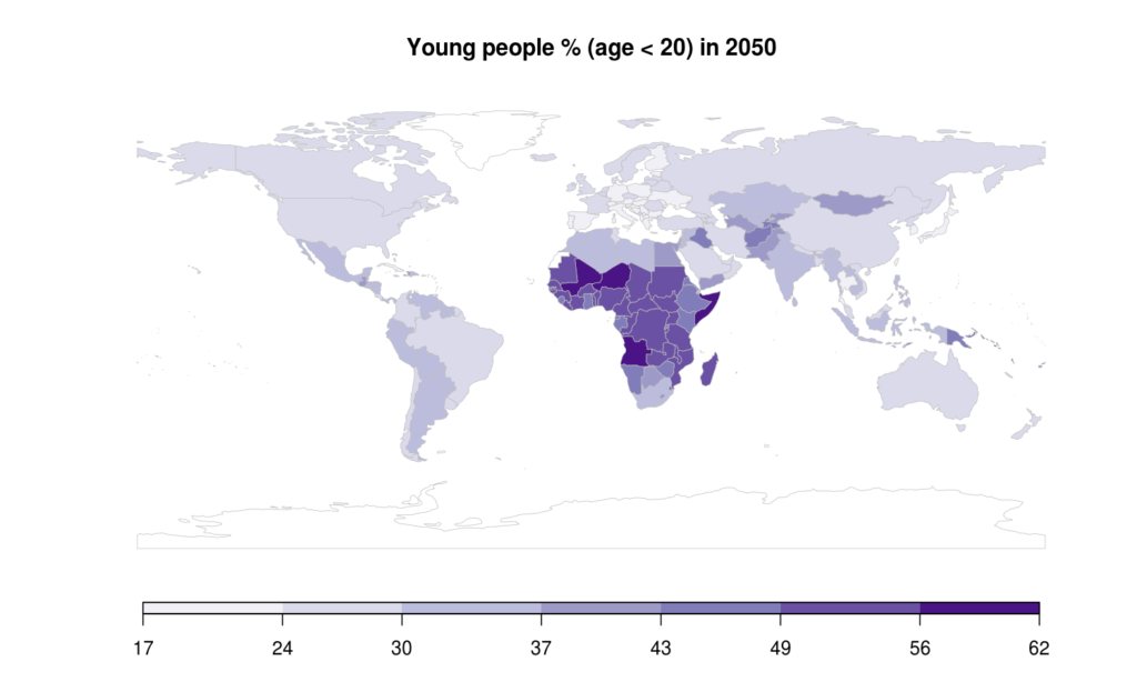
A very different picture of risk emerges for an epidemic that strikes mainly the young. In this case, risk rankings reflect the % of young people (under 20). The maps for 2020 and 2050 now show a very different ranking of risk. The risk to the young is often high in those countries where the risk to the old is low. But this isn’t always true – the difference depends on the interplay of low fertility and longer lives. A more detailed discussion of these and similar maps will follow at a later time.
Note: figures and captions updated on March 18